Jeremiah Brent was always the coolest dad at nursery drop-off. I have a vision of him, picking up his daughter Poppy while my son Ford looked on balefully. So well dressed, so collected, almost always in white or beige or black in fantastic drapey fabrics. He was ‘quiet luxury’ incarnated before that term became a pop culture phrase.
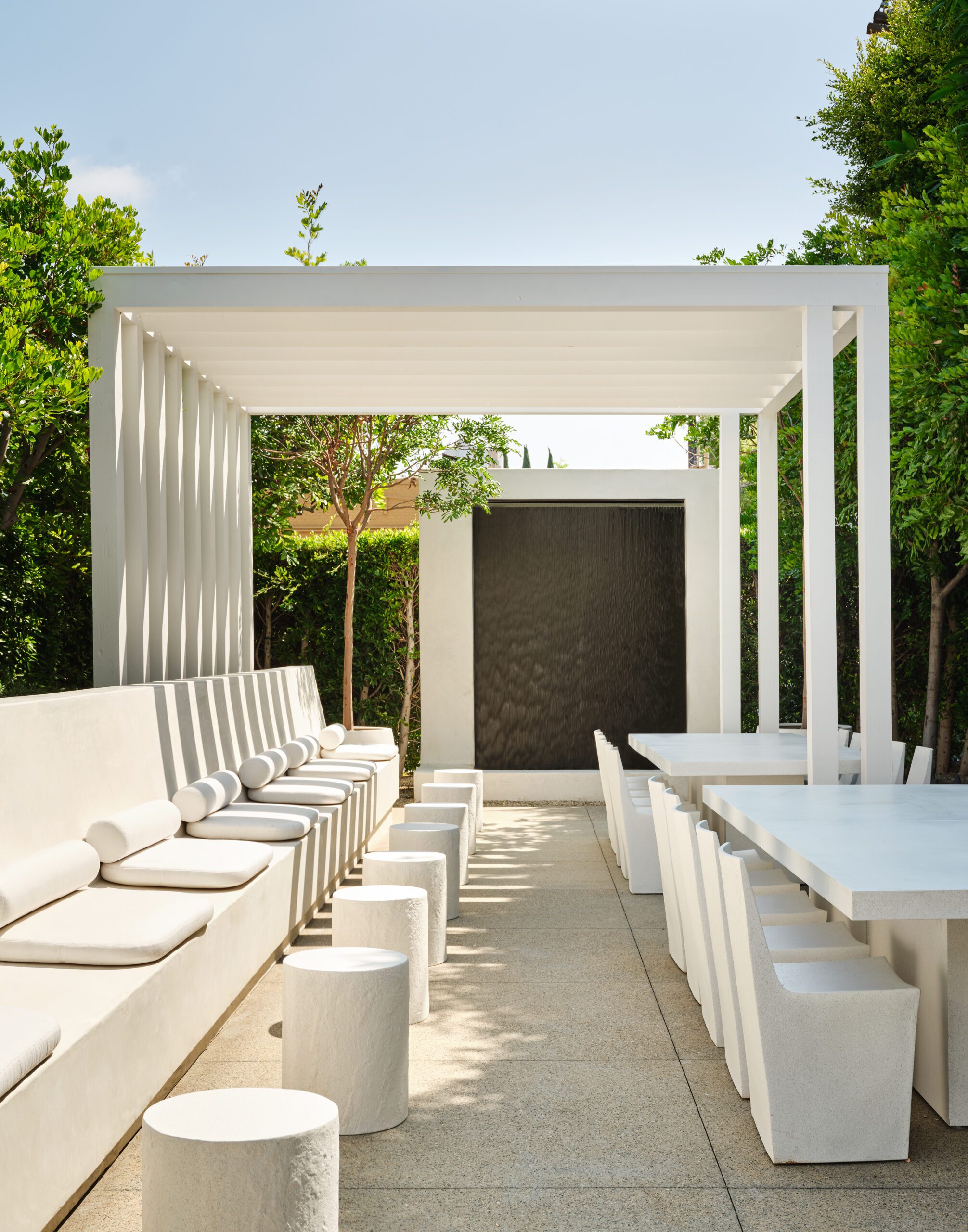
It was this quality that made me instantly think of hiring him when it came to doing a new office compound for me and my 50-strong employees. Previously, I had done my office on the Fox Studio lot in a sort of Californian earthy aesthetic – all tobacco silk rugs, industrial tables and odd art mixed with vintage Nakashima lamps and artifacts. But this time around, I wanted something new and modern.
“HE WAS ‘QUIET LUXURY’ INCARNATED BEFORE THAT TERM BECAME A POP CULTURE PHRASE.”
Hollywood, California
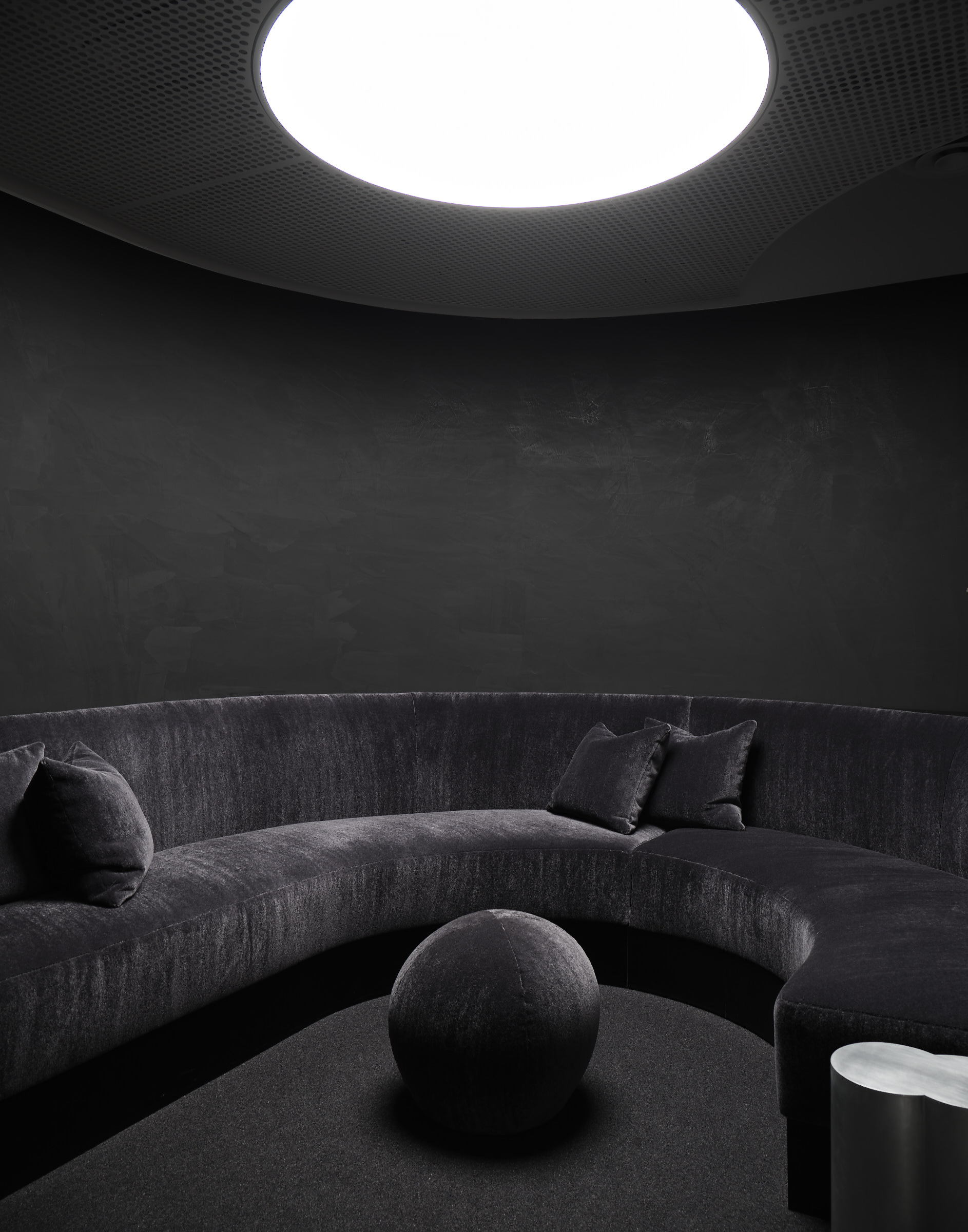
When I first showed Jeremiah around the warren of weird little rooms crammed with Silicon Valley twentysomethings eating pad Thai, I think he was shocked. (‘I was a little freaked out,’ says Brent. ‘It was such a big job, and a great but crazy concept.’) I told him I wanted two things, for it to be quiet, but to hum. I also gave him a clear directive to work towards – the mood was to be Halston in space. I wanted everything white and light, almost like being in a spaceship, with a downstairs area reserved for editors, a huge conference room for writers, and a café.
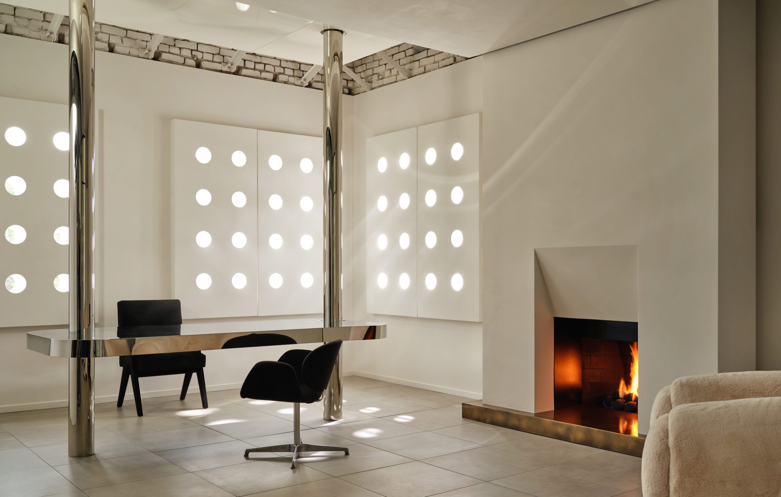
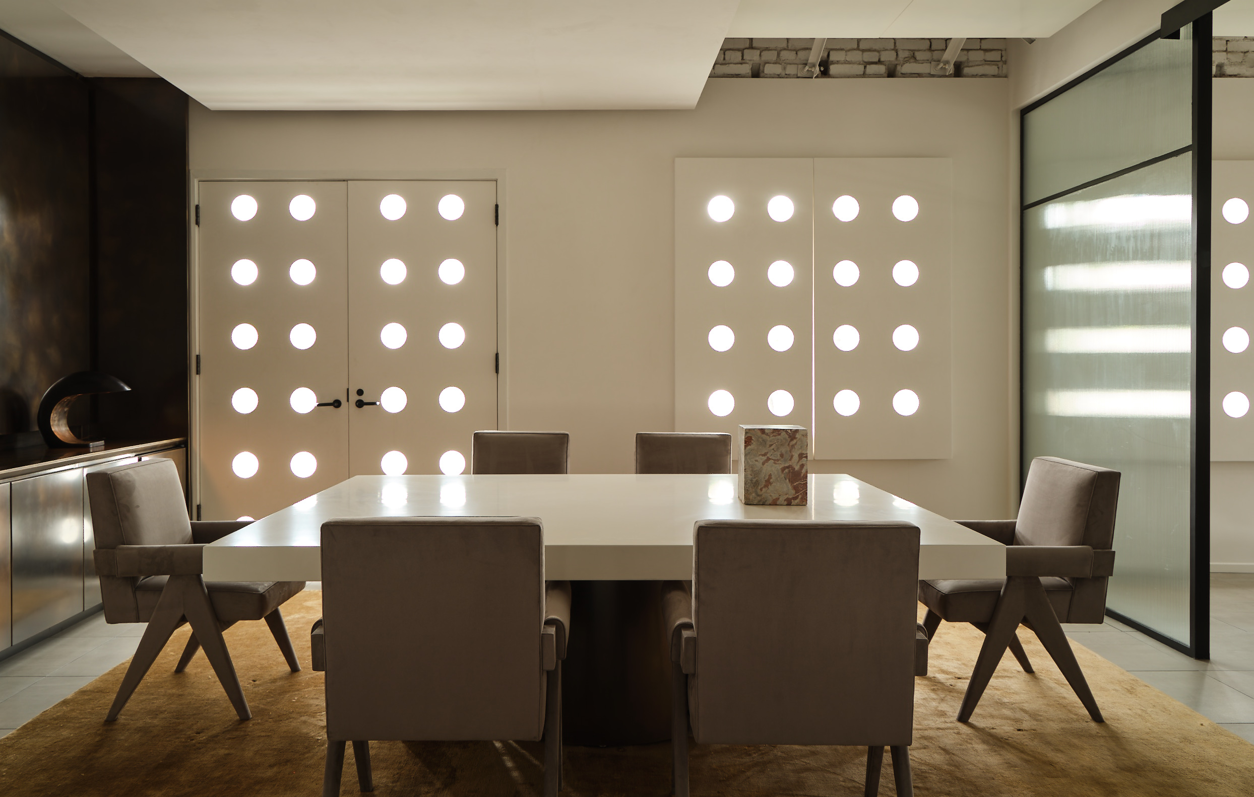
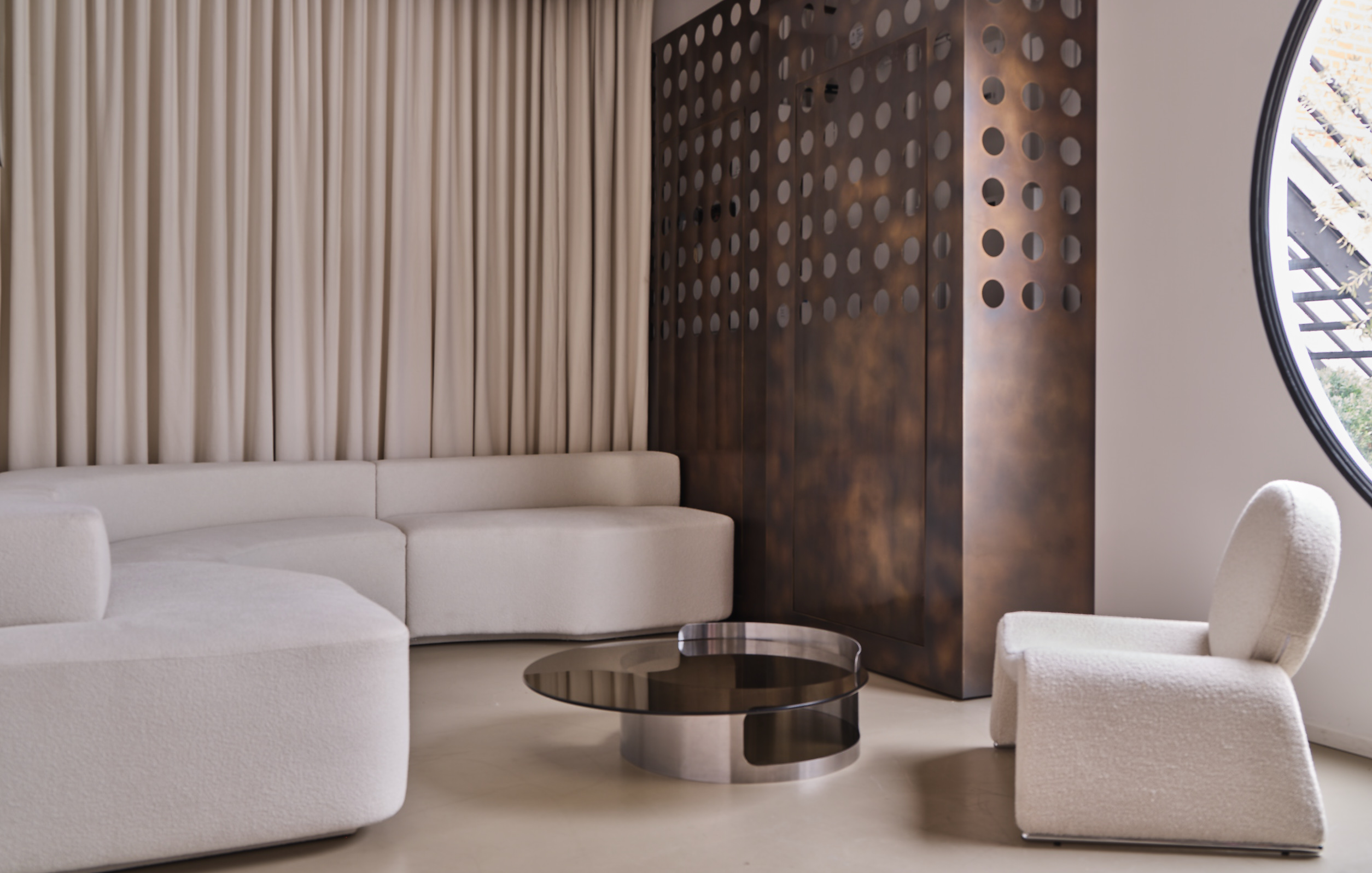
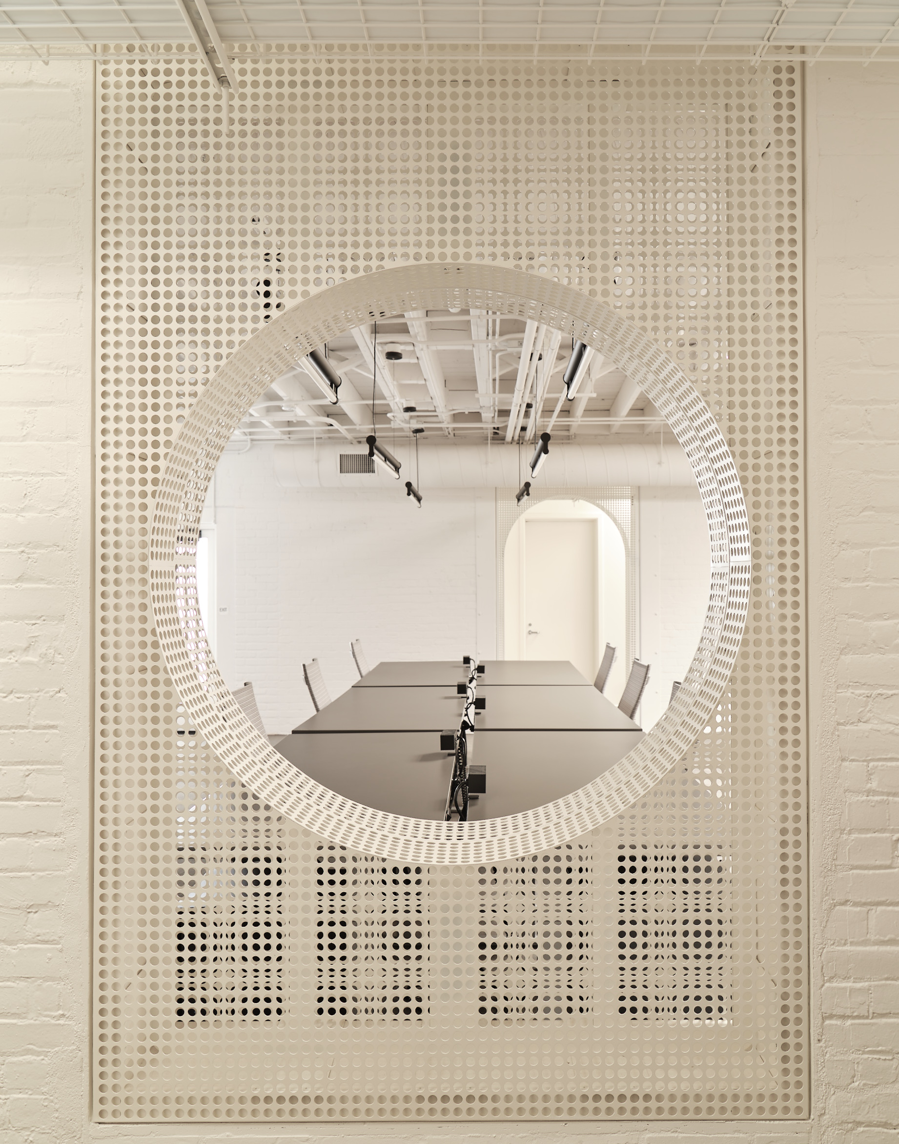
After gutting the space, the first thing Brent did was to create movement, passages to other environments, all done with a goal of grounding and calming down the previously chaotic space. One of the best things that he did was to create perforated arcs, shutters and walls, inspired by the work of
the renowned Hungarian-French designer Mathieu Matégot. ‘If we had a wall that seemed like a blockage, we perforated it,’ says Brent wryly.
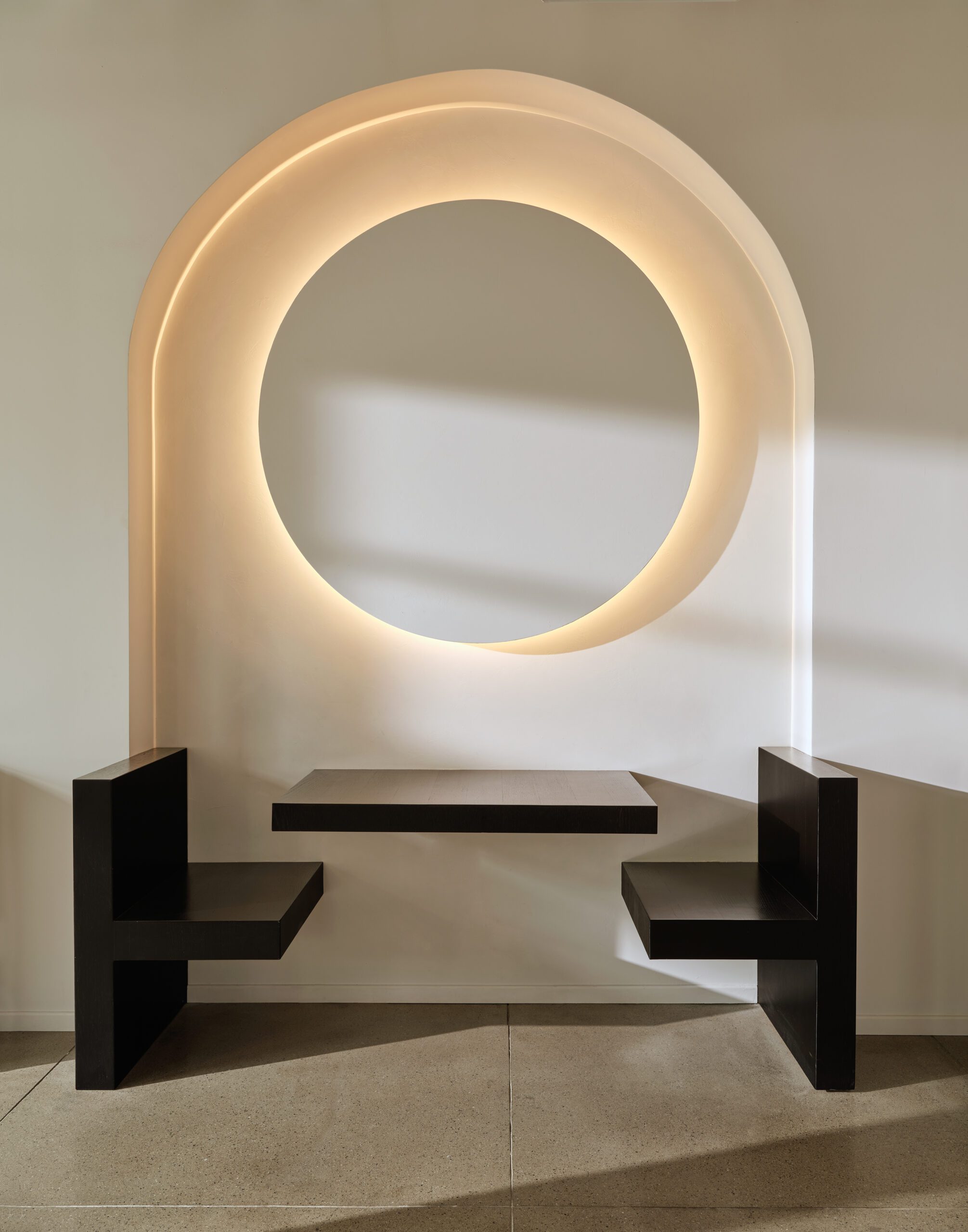
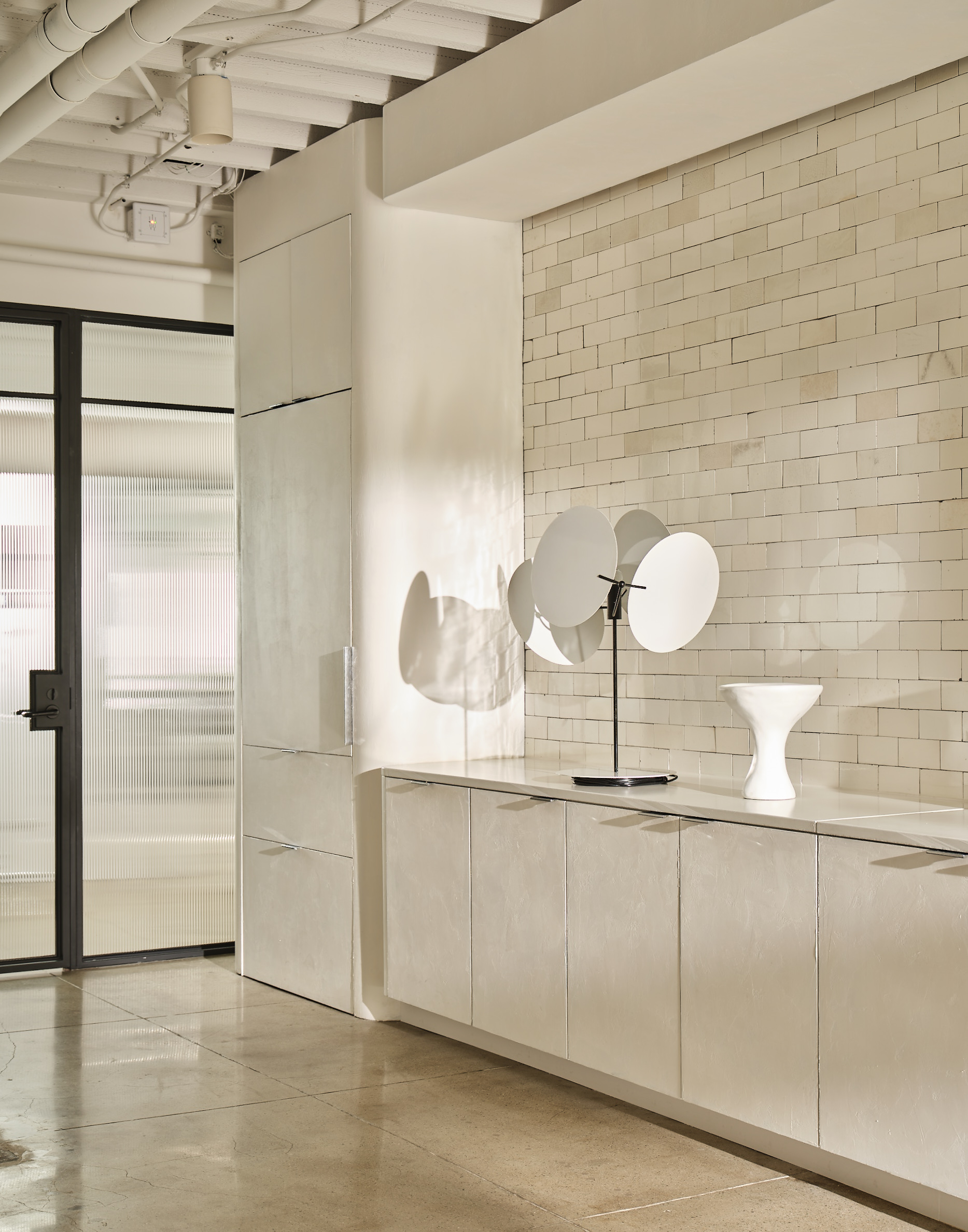
One other important ‘rule’ of the project was an exactingly curated group of colours and materials. Suede, marble and plaster were used throughout; if it could be plastered, it was. Bright primary colours were banished in place of hues that could lower your blood pressure: whites, creams and greys. And if it couldn’t be one of those colours, we used a metal in that shade. Chrome, for example. Lots of chrome.
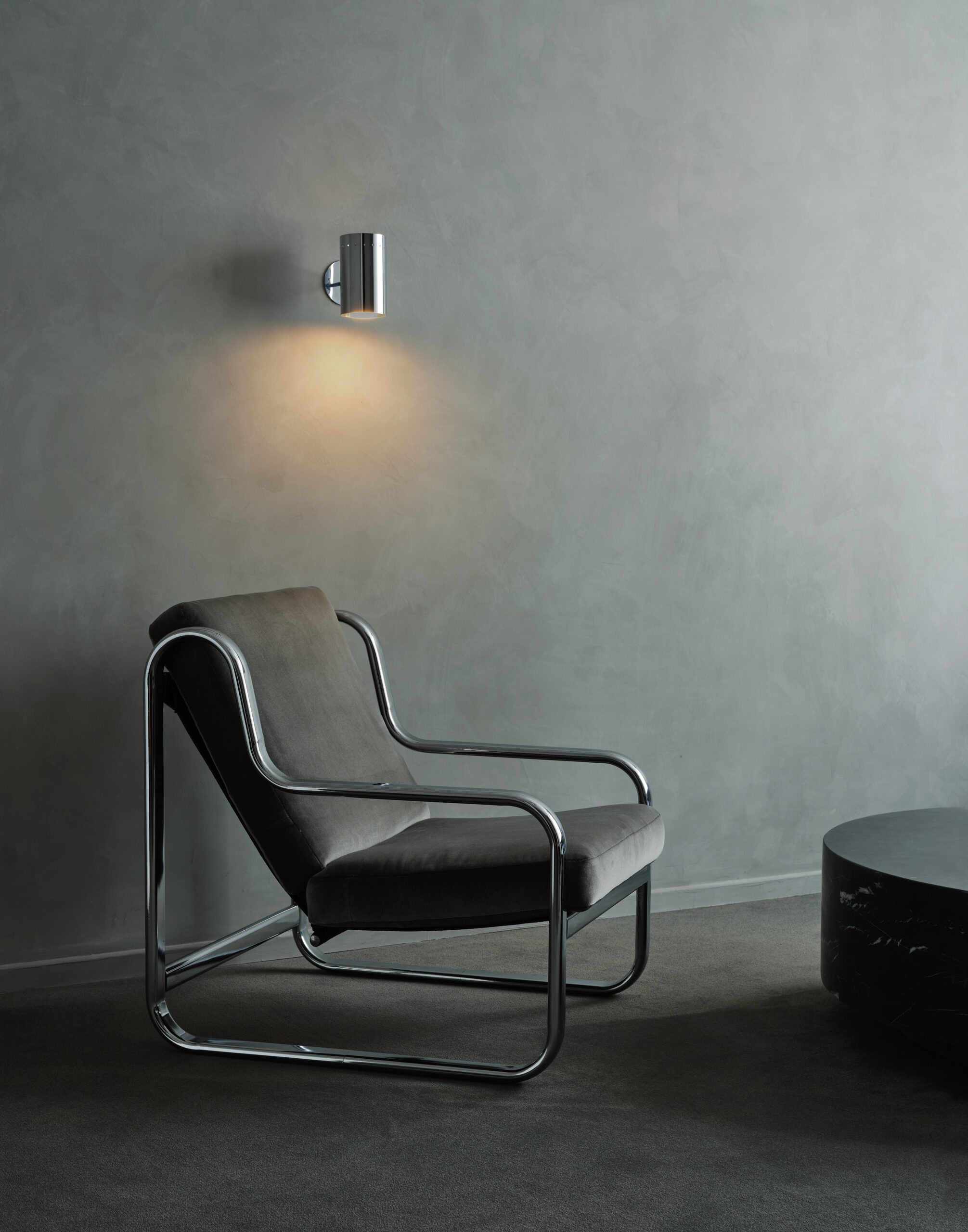
‘The end result was very much influenced by design of the 1930s and also the 1970s,’ says Brent of the office design. ‘Curved walls, cashmere drapery everywhere covering video monitors. Some people might say that was weird, but I looked at it all as a challenge.’
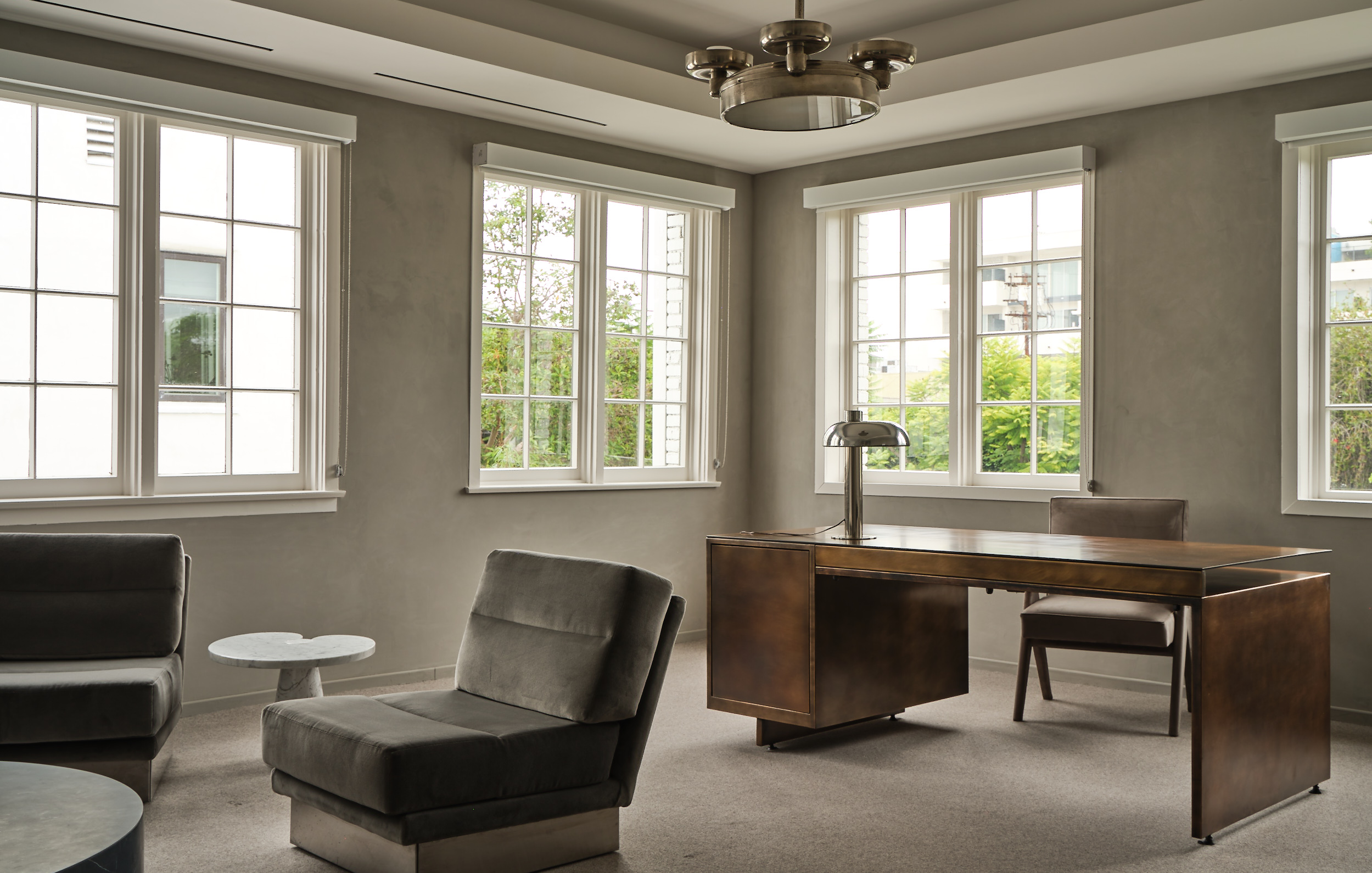
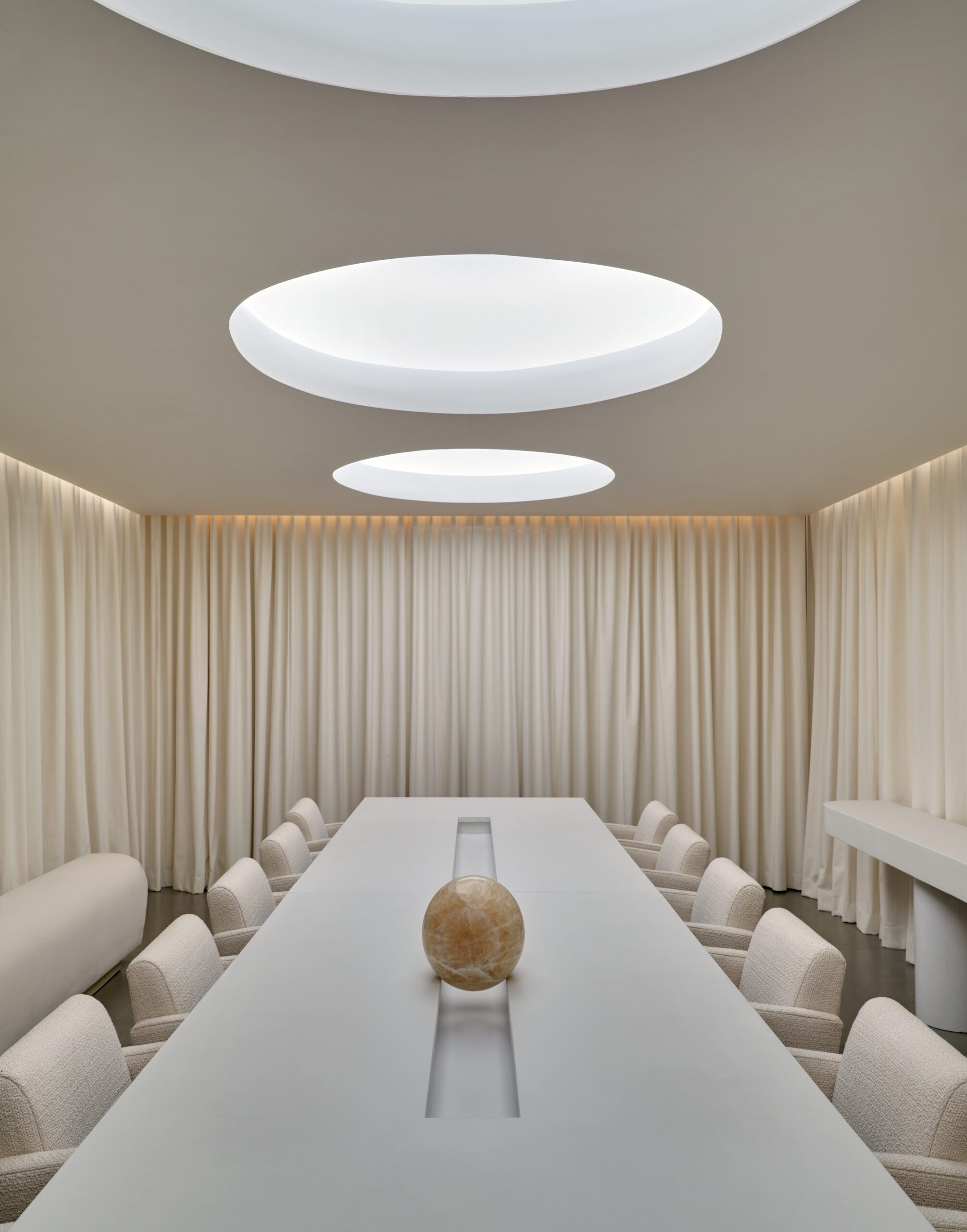
Almost everything in the office was bespoke, right down to the individual vintage subway titles that took three months to find and polish. My favourite area is the conference room, which sports a handmade poured concrete table that seats more than 15 people. There is no colour in this room, no distraction from creativity.
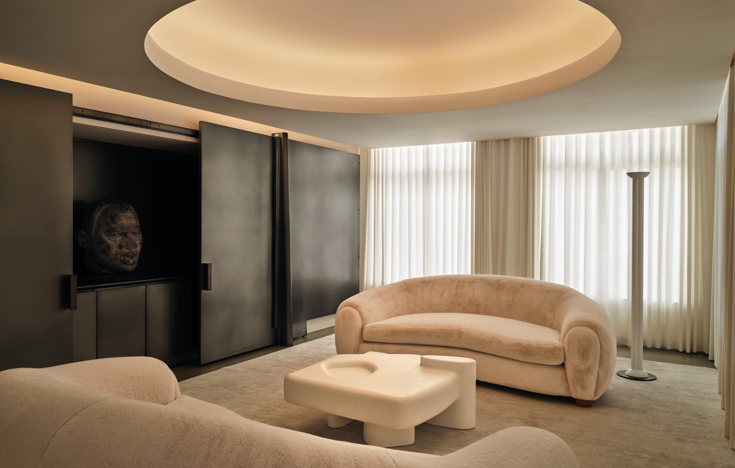
Jeremiah’s favourite room is my office, with its lacquered dropped ceiling, fireplace and Jean Prouvé-inspired windows. ‘What I loved about this office is how it set up areas of freedom,’ says Brent. ‘There were areas you could be on your own, creating, and there were areas where you could participate.’
Two years after we first toured the space together – and a construction period that lasted all through the Covid pandemic – Brent delivered just what I wanted. ‘Creating a space for so many people to create in was humbling,’ says Brent. ‘It was one of the hardest jobs that I ever had, but ultimately, one of the most rewarding.’